
Drop-down Navigation to Mega Menu
Client
Ortho Molecular Products
Role
UX Designer (Mid-project transition)
Duration
6 Weeks
Teams
Engineering, IT, Marketing
Project ownership
Competitive research
Information architecture
UX/UI design
Cross-functional collaboration
Engineering handoff
Rollout
Post-launch analytics
Challenge
When I joined Ortho Molecular Products, the mega menu project had stalled after the original designer left. I inherited existing wireframes and documentation, but little rationale behind the navigation structure or interactions.
The project was also being handled as one large initiative, with scope and designs continuously changing. This made it difficult for Engineering to know what was final, in scope, and ready to build.
What I inherited
Previous navigation
Navigation focused on individual pages, making it difficult for users to understand the relationship between our products, resources, and practitioner platforms.

Photoshop wireframes
Inherited in-progress Photoshop wireframes that served as the foundation for the redesign.

Approach
Understand
Reviewed the existing work and identified gaps in research and documentation.
Define
Analyzed competitor navigation patterns and mapped the site's information architecture.
Design
Rebuilt the designs in Figma and established reusable components.
Enable
Implemented a more structured implementation process through a phased approach with documentation.
Research
Our competititors




While sorting through the documents handed off to me, some questions that came up were:
What information belongs in the primary navigation?
How should categories be grouped?
What hierarchy makes sense for practitioners?
How are competitors solving similar navigation problems?
What content should be immediately discoverable?
I found that our competitors organized their products around health needs, education, and practitioner tasks so I needed to restructure how users were discovering our products and content.
Once I understood the existing navigation and competitive landscape, I translated the findings into a clearer information architecture.
Using the previous designer's work as a foundation, I organized the navigation around the ways practitioners were most likely to browse the catalog, while keeping frequently accessed content closer to the top level.
Existing navigation

Proposed navigation

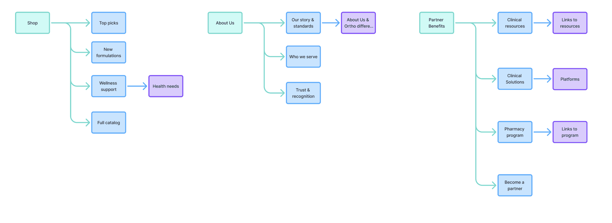
During the navigation mapping, I identified several navigation items that did not have corresponding pages in the existing site.
For example, the current navigation had separate pages for About Us and Ortho Difference, while the proposed information architecture introduced Our Story & Standards as a new navigation destination.
Creating and launching an entirely new page was outside the scope of the mega menu project. Rather than expanding the project scope or leaving the navigation item without a destination, I designed the navigation to link to the existing relevant pages.
Proposed navigation within scope of the project
Design
Scannability
Instead of presenting a long list of links, I used grouping and hierarchy to make the menu easier to scan.

Clear hierarchy
Primary categories are visually distinct from secondary navigation items so users can quickly understand the relationship between them.

Future scalability
Designed the navigation with future content and page structures in mind, creating a scalable foundstion without expanding the scope of the current project.

Hand-off
Instead of handing off the entire project at once, I broke the work into smaller stories with defined scope, documented behaviors, and clear handoff points. This gave Engineering a more predictable implementation path while allowing Design to continue working on subsequent phases without disrupting work already in development.
Story A
Site Selector
Story B
Primary navigation
Story C
Mega menu
Story D
Responsive
Each story had a defined scope giving Engineering a predictable path to implementation.
Results
Since the navigation has launched, I used the available analytics to understand where users were navigating through the new menu and which pages received the most traffic.
What I measured:
Traffic to pages accessible through the mega menu
Most-visited navigation destinations
Engagement with key products and health-need categories
Full Catalog received 7,127 page views after launch, making it the most-used shopping destination surfaced through the new navigation, followed by Best Sellers with 1,581 views.
This gave the team our first baseline for evaluating how the redesigned navigation was being used and which destinations were most valuable to users since page-level analytics were not tracked prior to launch.