
UBYou Personalized Mental Wellness
Client
UBYou Wellness
Role
UX Design Intern
Duration
6 weeks
Industry
Student Wellness
Teams
Stakeholder, Engineer
Challenge
The existing dashboard lacked a clear, supportive structure, and the check-in experience oversimplified emotions with a single mood selection.
Solution
Redesigned the wellness check-in and dashboard by introducing guided emotional reflection and a dashboard that prioritized users' emotional trends and wellness resources.
Current dashboard & check-in

Design Process
Working closely with the stakeholder, I redesigned the check-in experience to move beyond a single mood selection. Using the Feelings Wheel as a foundation, we introduced a broader range of emotions so students could describe how they were feeling with greater accuracy rather than choosing from only a handful of options.
To make the experience more meaningful, I mapped follow-up prompts to the realities of student life. We identified common influences on emotional wellbeing (academics, friendships, finances, physical health, homesickness, and campus involvement) and used these themes to guide contextual reflection prompts. This encouraged students to recognize patterns behind their emotions instead of simply logging a mood.
Check-in flow
Expanded emotions

Reflective prompts
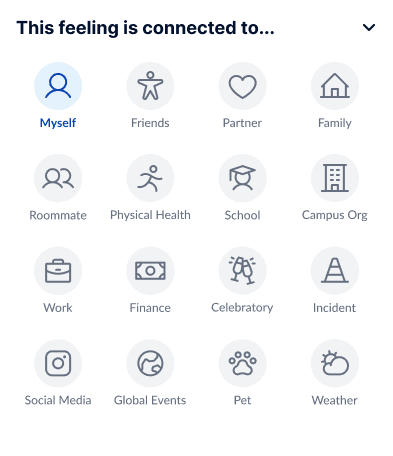
Contextual reflection

After reviewing stakeholder data and high-traffic route reports, I identified the platform's primary user goals:
Complete a daily wellness check-in
Find campus support resources
Access wellness activities like meditation, breathing exercises, and workouts
Dashboard
Daily check-in
Featured activity

Featured resources

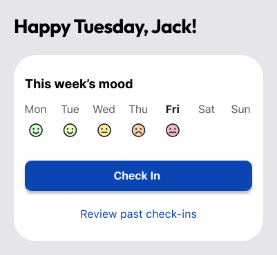
These journeys informed the dashboard redesign. Instead than presenting equal-weight content, I prioritized the actions students used most frequently by surfacing the daily check-in as the primary call to action, organizing support resources into clear categories, and featuring personalized wellness activities and campus resources directly on the home screen. This reduced navigation effort while encouraging ongoing engagement with the platform.
Results
Post-launch surveys revealed positive feedback around the app’s more modern and engaging experience. Students reported that the expanded emotions and follow-up prompts helped them track their moods more accurately, while personalized resources made the wellness experience feel more supportive and relevant.
"This version is a lot cleaner and has easier information to navigate from. It looks less cluttered from the current version"
-Existing User Tester #2
Post-Internship
One of the most valuable lessons from my internship was learning to navigate team conflict professionally. While several interns requested reassignment due to disagreements within the team, I chose to remain on the project, viewing it as an opportunity to strengthen my communication and collaboration skills.
The experience reinforced my belief that successful products are built by working through challenges together, not avoiding them. Following the internship, I was the only intern offered a contract position, which reflected my commitment to collaboration, professionalism, and the team's success.