UBYou Campus Wellness
UBYou is a student campus wellness app that connects students to FGCU's campus resources and self-care activities to support their well-being and success.
View prototype


Role
Responsibilities
UX Design Intern
Identified MVP features and built user flows for key routes
Updated site map for more cohesion and clarity
Assisted design lead on design system creation
Weekly meetings with stake holder and design lead to present design concepts and iterations
Communicated rationale behind design choices to stake holder
Duration
Deliverables
4 weeks
Redesign home screen to improve user engagement
Expand and enhance the Wellness Check-In feature
Develop new user flows for Resources sections


Getting Up to Speed: Understanding UBYou’s Current State
To integrate seamlessly into the UBYou team, I first met with key stakeholders and the design lead to gain a clear understanding of where the app currently stood in its development.
I gained a clear understanding of where the previous design team left off, the primary user, the app’s current challenges, and the key areas for improvement.

Primary User
Students attending Florida State Gulf University. Based on previous research, the two most used functions of the app from students were:
Campus Resources
Wellness Check-In
Current Challenges
Home Screen Feedback: Users provided mixed feedback on the current home screen.
Campus Resources Page: Some users felt overwhelmed by the information presented.
Design Consistency: The app's UX and UI are not cohesive.
Contraints
Separate Resource Categories: Campus Resources and UBYou’s Resources must be clearly distinguished.
Brand Colors: The design should incorporate the green and blue colors from UBYou's current logo.
Project Plan
Identify MVP features and 1.0 features
Organize information architecture to create a new site map
Create user flows and wire frames for key routes
Create mid-fidelity prototype for usability testing

Current Screens

Defining the Core Experience: Selecting MVP Features & Structuring the Information Architecture
To ensure UBYou’s Minimum Viable Product (MVP) focused on the most impactful features within the time constraint of the project, my team and I carefully analyzed user needs and business goals.
We prioritized features that would provide immediate value while allowing room for future expansion. Alongside this, we restructured the app’s information architecture to improve navigation and clarity. By organizing content into a clear and intuitive site map, we streamlined the user experience, ensuring students could easily access the resources they needed without feeling overwhelmed. This process laid the foundation for a more cohesive and user-friendly app.
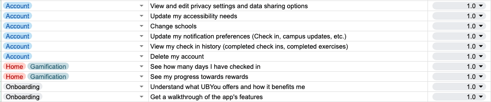
MVP Features

1.0 Features
Site Map - Before

Site Map - After

Mapping the User Journey: Crafting Key User Stories
Based on the stakeholder's insights on high-traffic routes, we developed user stories to define core tasks across three critical user flows.
Key User Flows

Completing Wellness Check-In

Searching for Campus Resource

Completing Meditation Session
From Ideas to Paper: Brainstorming & Initial Sketches
After identifying the key flows, my team and I individually brainstormed and sketched our vision for the dashboard. This approach allowed us to explore diverse ideas and perspectives, ensuring we considered multiple solutions. After reviewing our concepts with the design lead and stakeholder, my design was selected as the foundation for the final dashboard.
Initial Sketches
Evolving the Dashboard: From Concept to Final Design
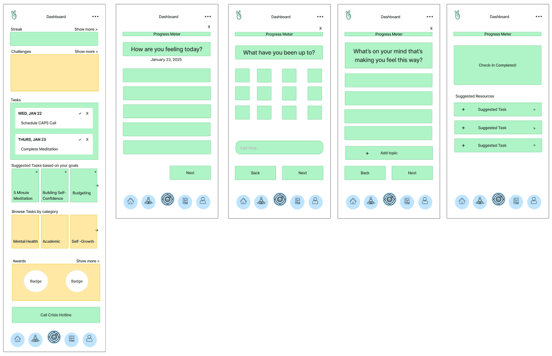
After the design was selected, we refined the dashboard through multiple iterations, incorporating feedback from stakeholders on layout, design and color.
Icons were chosen over images for the card design to ensure they didn't visually compete with the wellness check-in CTA button.
Color Selection
Despite the stakeholder's initial preference for consistent primary blue and green usage throughout the app, I developed wireframes showcasing varied hues. This allowed the stakeholder to visualize alternative color palettes, while maintaining the primary blues and greens as accent colors, addressing their initial request while expanding design options.
Dashboard Iterations

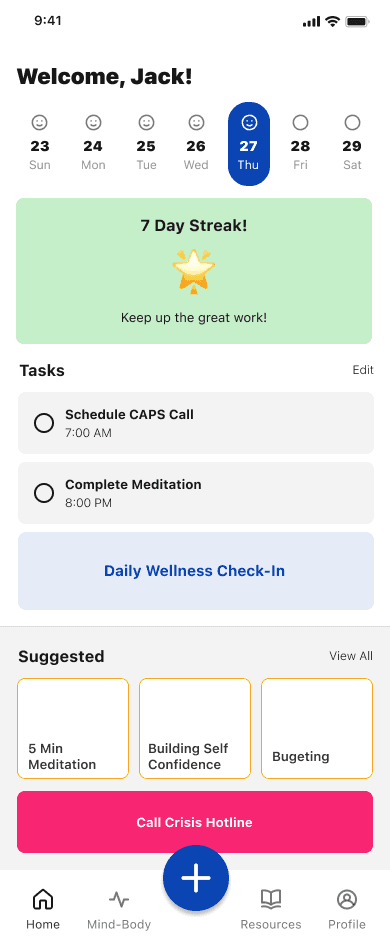


Mid-Fi Prototype for UBYou: Testing Key Features for User Feedback
Next, a mid-fi prototype for UBYou was created, designed for the next set of interns to test key features and refine the app based on user feedback. This prototype focuses on the core user flow of the mental wellness check in and navigating through the campus resources.
Overcoming Communication Challenges: Improving Team Alignment and Collaboration
One of the key learning experiences of this internship was navigating team disagreements. The design lead at UBYou faced a lack of trust from the intern team. While I attempted to mediate, the team collectively requested new assignments, a request that was ultimately denied.
However, I understood that professional environments require collaborative problem-solving, not avoidance. I was the only member that asked to remain on the project, recognizing the importance of professional communication and problem solving in real-world scenarios.
My approach was rooted in conflict resolution. In a real-world scenario, I would prioritize communication and collaboration to resolve disagreements with product managers, developers or design leads, rather than seeking an exit. I believe this mindset, along with my commitment to the team’s success, contributed to me being the only intern that was offered a contract position after our internship ended.
Letter of Recommendation from the Founder: Jack Hellmer
